Colour is a universal language, speaking to emotions, memories, and even our sense of well-being. Studies have shown that up to 90% of snap judgments about products can be based on colour alone (Institute for Colour Research). That’s powerful! As an artist, I use colour not just as an aesthetic choice but as a tool to convey energy, movement, and emotion in my contemporary wildlife art. Every hue I choose holds meaning, creating a connection between my paintings and those who view them.
The Emotional Power of Colour
Each colour has a psychological impact, evoking different feelings and reactions. Studies indicate that blue is the world’s favourite colour (YouGov survey), likely due to its calming properties. In my artwork, I embrace colour to tell a story beyond the subject itself. For example:
-
Blues and Turquoises – The colours of the ocean, evoking calm, serenity, and depth. Research shows that blue can lower heart rates and reduce stress (Kaya & Epps, 2004), which is why it forms the foundation of my Crystal Clear Waters Collection (see the collection here), bringing a sense of tranquility and wonder, much like staring into a pristine lagoon.

-
Yellows and Golds – Vibrant and full of life, these hues symbolise warmth, positivity, and energy. Interestingly, yellow is associated with increased metabolism and attention (Pantone, 2021), which is why it’s often used in fast-food branding! My bee paintings use golden tones to highlight the importance of productivity and community (shop bee paintings here).

-
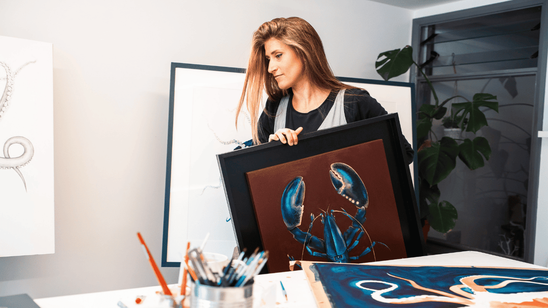
Reds and Oranges – These colours represent passion, vitality, and strength. Studies show that red can increase heart rate and create a sense of urgency (Labrecque & Milne, 2012), making it a great choice for capturing the raw energy of the ocean and its ever-changing beauty. My Red Octopus (see the collection here) is a perfect example of how bold reds and fiery oranges can bring a sense of drama and movement to marine life art.

-
Greens – A colour of growth, harmony, and renewal. Research suggests that green can enhance creativity and reduce stress (University of Munich, 2017), so I love incorporating it into my wildlife art to reflect nature’s balance.
-
Purples – Associated with creativity, mystery, and luxury, purple has historically been a colour of royalty and deep spiritual significance (Elliot & Maier, 2014). It’s known to stimulate problem-solving and imagination, making it an essential tone when creating art that feels both dreamlike and powerful.
-
White and Negative Space – White is often associated with purity, simplicity, and openness. In my work, I use white backgrounds extensively to create a sense of space, allowing the vibrant colours to take centre stage. Research suggests that white space in design helps improve focus and perception (Lidwell, Holden, & Butler, 2010). see prints here !
-
Iridescence and the Play of Light – Iridescent colours, such as those found in fish scales or butterfly wings, fascinate us because they shift depending on the angle of light. Studies suggest that our attraction to iridescence is tied to its dynamic nature, engaging our brains in processing multiple colours at once (Prum, 2017). In my work, I use iridescent paints to create a shimmering effect that mimics the way light interacts with natural elements like water and marine life. Best Sellers of iridescent Prints here

Colour and Movement in Wildlife Art
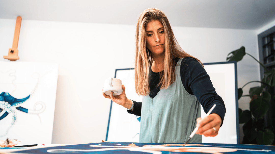
Wildlife is never static, and I use colour to reflect that dynamic energy. By blending shades in fluid, organic ways—sometimes using feathers or shells as painting tools—I create movement within each piece. This technique allows my paintings to feel alive, as though the creatures could swim, flutter, or scuttle right off the paper or canvas into your room.
Colour and Connection
My love for colour stems from its ability to spark joy and connection. Did you know that colour can improve memory performance by up to 50% (University of British Columbia, 2009)? Whether it’s the deep blue of a jellyfish’s tentacles or the fiery orange of an octopus, every shade is chosen to create an emotional response. As a contemporary Impressionist Realism artist, my goal is to strike a balance between capturing realism and allowing colour to guide the viewer’s experience.
The Ever-Evolving Influence of Colour
Moving to Paris next year will undoubtedly bring new influences and perspectives to my palette. The city’s artistic vibrancy, the soft hues of its architecture, and the shifting tones of the Seine will inspire new creations. I look forward to seeing how my relationship with colour continues to evolve.
Colour is more than just pigment—it’s emotion, energy, and storytelling. Through my contemporary wildlife art, I hope to bring the beauty and power of the natural world into the hearts and homes of others, one brushstroke at a time.
Explore more of my colour-driven wildlife artwork at www.samanthafrancesart.com and join my Beach Club for exclusive insights into my creative journey!

Leave a comment